Data visualization
The next task we need to learn is how to plot the data. Data visualization is a powerful technique that often highlights useful patterns in the data. We will specifically try to plot the different trajectory of corn production for different states over the years.
To do this, we will need to learn about
- Boolean vectors
- Character vectors
- Vectorized operations
- Subsetting
- Data frames
- Plotting functions
Subsetting
Before, we taught about subsetting vectors using numerical vectors, e.g.
arbitrary_data <- 10:15
print(arbitrary_data[2])
print(arbitrary_data[2:4])
But turns out you can subset using boolean vectors and character vectors. We show some examples below:
arbitrary_data <- 10:15
names(arbitrary_data) <- c("a", "b", "x", "y", "z")
print(arbitrary_data)

# Subsetting with character vectors
print(arbitrary_data['a'])
print(arbitrary_data[c('b', 'x', 'z')])

# Subsetting with boolean vectors
bool_vec <- c(FALSE, TRUE, TRUE, FALSE, TRUE)
print(arbitrary_data[bool_vec])
Things to notice:
- The same “subset” operation could be achieved via different means.
- To subset using character vectors, we had to change the “name” for the different elements in the vector.
- To subset using boolean vectors, the boolean vector needs to be the same length as the original vector.
Quick note on data types
It is important to know data types in programming because
- Many functions behave differently when it interacts with different types of data
- Data types will help you understand many errors.
The general philosophy in programming is to trigger errors/warnings early on
before it’s too hard to find the mistake. So operations that are not sensible,
e.g.
1 + "a", will often produce an error to act as an enforcer of writing logical code. - Certain data types are capable of different operations and wrangling the data into the most suitable type will increase your efficiency.
What are character vectors?
Character vectors are composed of character strings like "a",
"hello", c("statistical", "computing"), etc
Characters values can be used to change axis labels, create file names dynamically, or find keywords in job descriptions.
A common function we’ll use with characters is paste0() that
combines different characters together.
alphas <- c('a', 'b', 'c')
paste0('file_', alphas, '.csv')
You can also give names to different elements
num_rolls <- 5
coin_tosses <- sample(c(1, 0), num_rolls, replace=TRUE)
names(coin_tosses) <- paste0('toss', 1:num_rolls)
print(coin_tosses)
print(coin_tosses['toss5'])
What are boolean vectors?
Boolean values are TRUE or FALSE values.
These are often created as a result of a logical statements like 1 < 2
Boolean values can be used to identify outliers, filter data that belongs to a particular group (e.g. country), or control the flow of code (we’ll explain this later).
When using booleans to subset another vector, only the elements corresponding to the TRUE values will be kept
nums <- 1:5
nums[c(FALSE, FALSE, TRUE, TRUE, TRUE)]
One important feature about boolean values is that they behave like 0 or 1 values when we perform arithmetic with them.
TRUE + FALSE
TRUE * FALSE
FALSE + FALSE
TRUE * 3
sum(c(TRUE, TRUE, FALSE))
Vectorized operations with vectors
It is common to operate between a vector and a single value. For example, checking which numbers are larger than a certain value.
nums <- 1:5
larger_than_3 <- nums > 3
print(larger_than_3)
In the code above, nums is a vector of length 5. When compared
to 3, a constant, the comparison was carried out between each
element in nums and the value 3 as in the following code:
larger_than_3 <- c(1 > 3, 2 > 3, 3 > 3, 4 > 3, 5 > 3)
print(larger_than_3)
The distribution of the operation across the vector is a form of the vectorized operation. This can happen with other operations too:
nums <- 1:5
print(nums - 3)
print(nums * -1)
Why bother with vectorized operations?
- We can subset specific elements from a vector using the boolean vector created. This is common
in data cleaning or when you want to analyze a sub-population more closely.
nums <- 1:5 larger_than_3 <- nums > 3 print(nums[larger_than_3]) - We can create transformed data much faster, imagine the task of subtracting the mean from
a vector of data using a loop vs using vectorized operations:
data <- sample(c(0, 1), 10, replace=TRUE)
avg <- mean(data)

# Using vectorized operations (1 line!)
mean_0_data_vecop <- data - avg

# Using a for-loop (2-4 lines!)
mean_0_data_forloop <- c()
for(i in 1:length(data)){
    mean_0_data_forloop[i] <- data[i] - avg
}

print(mean_0_data_vecop)
print(mean_0_data_forloop)
Other Boolean Operators
The most common logical statements are:
| Code | Operation | Example |
|---|---|---|
! |
negation of | !TRUE |
> |
greater | vec_demo <- 1:5vec_demo > 2 |
== |
equal | vec_demo <- c("A", "B", "B")vec_demo == "A" |
>= |
greater or equal | vec_demo <- 1:5vec >= 2 |
<= |
less or equal | vec_demo <- 1:5vec <= 2 |
!= |
Not equal | vec_demo <- c("A", "B", "B")vec_demo != "A" |
& |
and | vec_demo <- 1:5(vec_demo > 2) & (vec_demo >= 2) |
| |
or | vec_demo <- 1:5(vec_demo > 2) | (vec_demo >= 2) |
For the & and | operation, it’s especially important to understand:
- Order of operations. Notice how we added
()to ensure that the expressions are evaluated into boolean terms between the&and|operation. Although your code would run fine in R, it’s best to be explicit in these cases. - The behavior with with different inputs:
-
For the “and” operation, you’ll get TRUE only if all the inputs are TRUE, the outcome of
x&yis:x & yy=TRUEy=FALSEx=TRUETRUEFALSEx=FALSEFALSEFALSE -
For the “or” operation, you’ll get TRUE as long as one input is TRUE, the outcome of
x|yis:x | yy=TRUEy=FALSEx=TRUETRUETRUEx=FALSETRUEFALSE
-
Vectors again!
Recall that vectors are a collection of data with a type and length. We mentioned that the data within a vector had to all belong to the same type before. We show that again here
num_demo <- 1
demo_vec <- c(num_demo, 'hello')
class(num_demo) == class(demo_vec[1])
- Please examine the class of
demo_vec - Why? Intuitively, vectorized operations only make sense if we can perform the same operation on each element. Therefore restricting each element to be the same in a vector is important for us to be able to carry out efficient vectorized operations.
Special data types - missing values
A very special type of data is the missing data type and data types that are easily mistaken as missing values.
The missing value data type is NA in R. Properties of NA include:
- It can be any other data type
na_demo <- NA num_vec <- c(na_demo, 1:5) print(na_demo + 1) print(mean(num_vec)) - Most operations with NA will propagate the NA downstream
na_demo <- NA num_vec <- c(na_demo, 1:5) char_vec <- c(na_demo, "hello") NA values can be any data type print(class(na_demo)) print(class(num_vec[1])) print(class(char_vec[1])) - To check if a value is
NA, you need to use theis.na()functionna_demo <- NA num_vec <- c(na_demo, 1:5) # is.na() with NA print(na_demo == NA) print(is.na(na_demo)) # is.na() is vectorized! print(num_vec == NA) print(is.na(num_vec))
What’s the point of missing values?
Missing values are great defaults because no data can be better than bad data.
For example
- When reporting rain data from weather stations, defaulting data to 0 (i.e. no rain) seems sensible at times but then you lose the ability to differentiate a confirmed 0 rain event or simply a loss in data.
- When examing surveys with minorities, there can sometimes be missing or only one respondent, in either case, “margin or error” calculations are not possible and an NA is more appropriate than estimating the data.
- When handling surveys with “non-response”, you often want to be notified
if there are missing values. For example,
imagine a psychology survey where you have 3 questions asking about
people’s well-being, and some people do not answer your question with
10% chance. Then you may want to know how many complete surveys you’ll have.
sim_num <- 100
# Let 0 be disagree and 1 be agree to the survey question
survey_answers <- c(NA, 0, 1)
sim_avgs <- rep(NA, sim_num)
for(i in 1:sim_num){
    sim_data <- sample(survey_answers,
                       size=3,
                       replace=TRUE,
                       prob=c(0.1, 0.45, 0.45))
    sim_avgs[i] <- mean(sim_data)
}
# Calculate the percentage of cases that are NA
mean(!is.na(sim_avgs))
Next most common collective data type - Data Frames
Data frames are most often thought of a collection of vectors, each capable of being a different type.
student_roster <- data.frame(
    student_id = 1:3,
    family_name = c("Doe", "Lee", "Liang"),
    given_name = c("John", "Billy", "Sally"),
    dropped = c(TRUE, FALSE, FALSE),
    stringsAsFactors=FALSE)
print(student_roster)
print(class(student_roster))
print(colnames(student_roster)) # colnames = column names
print(dim(student_roster)) # dim = dimension
print(length(student_roster))
Above, we create a data frame named student_roster with 4 different
columns, 1 numeric, 2 character, and 1 boolean vector. The argument
stringsAsFactors=FALSE was made to ensure character values remained
characters because the default in R is to convert them into factors
a different type of data we will introduce later.
Some things to note:
- Unlike vectors, data frames can hold different types of data which is very convenient like Excel Spreadsheets.
- Notice that the
length()argument corresponds to the number of columns, we will learn why this is the case in the future. - Data frames have 2 dimensions, rows and columns
Subsetting different columns and rows
Similar to vectors, you can subset data frames using the []
operator but with some modifications.
As a practice, try walking through the code below, line by line, to guess what’s happening before being told what’s happening!
student_roster <- data.frame(
    student_id = 1:3,
    family_name = c("Doe", "Lee", "Liang"),
    given_name = c("John", "Billy", "Sally"),
    dropped = c(TRUE, FALSE, FALSE),
    stringsAsFactors=FALSE)

# To get the 2nd column with integers
student_roster[, 2]
# To get the 2nd row with integers
student_roster[2, ]

# To subset by column with character vectors
student_roster[, c('family_name', 'given_name')]
# A common alternative if you only need one column is to use "$" followed
# by the column name without quotes
student_roster$family_name

# To subset using booleans, e.g. those who have NOT dropped the class
dropped_class <- student_roster[, "dropped"]
student_roster[!dropped_class, ]
Things to notice:
- Notice that similar rules apply to data frames as vector subsetting
- you can use different data types to subset, e.g. integers, characters, booleans
- booleans should share the same length as the number of rows or columns
- you can subset using a single value or a vector
- To specify subsetting row vs column, you use the
,within[]to differentiate the two cases.
Reading data from existing files
The most common way to get a data frame is actually by reading in an existing file like fisher_1927_grain.csv that contains the data from 1927 harvests with different treatments.
Download the fisher_1927_grain.csv file.
The function to read in this type of data is read.csv()
df <- read.csv("~/Downloads/fisher_1927_grain.csv")
A few things to know:
- If you get an error, don’t worry yet, we’ll cover most cases later.
- The code above assigns the data into a variable named
df. - The input to
read.csv()is a character that describes the path and name of the file. csvstands for “comma separate value” which means each value in the file is separated by a comma. If you read the file successfully though, notice that you don’t see any commas in the data.
Common errors when loading data
If you encoutered an issue when you tried to read in the file, here are some common mistakes that beginners do:
- Typo in function or file name, notice the error produced when the file
name or function name is misspelled
# Using "_" instead of "." in the function name df <- read_csv("fisher_1927_grain.csv") # Misspelling the name has a different error! df <- read.csv("fisher_1927_straw.csv") # ODDLY, the filename is NOT case sensitive with R df <- read.csv("FISHER_1927_grain.csv") - Not knowing “where” the file is stored or R’s working directory.
When you download a file, it is stored in a certain folder on your computer.
You need to be able to specify how R can find that file from its working folder.
- If R’s working directory is in
"/Users/wayne/Documents/School/Spring2020/UN2102"and the data is under a folder called"/Users/wayne/Documents/School/Spring2020/data"then in R, you could use 2 approaches:- The relative path:
df <- read.csv("../data/fisher_1927_grain.csv"). The relative path is the file’s location relative to R’s working directory. The examples specifies “go up one folder, then find a folder named data, then find a file called fisher_1927_grain.csv” - The absolute path:
df <- read.csv("/Users/wayne/Documents/School/Spring2020/data/fisher_1927_grain.csv"). The absolute path is the path from the root of your computer. This can be used without knowing where R’s working directory is.
- The relative path:
- To know what your current directory is, you can use the following functions
(warning, the same folder name can appear under different branches of your
computer so be sure the path is aligned):
getwd(), running this without any arguments will tell you where R’s working directory is- The working directory is like “the folder” that R is working from
list.files(), this will show you which files can be observed in R’s working directory.setwd('THE_PATH_YOU_WANT_TO_MOVE_TO'), running this with the proper string will help you move your working directory to the desired “folder”
- If R’s working directory is in
Arguments in read.csv()
You should look at ?read.csv to see the type of arguments that can change
how the program reads your file. The function relies on the file to be properly
formatted in a certain way to help differentiate different data values,
numbers vs characters, and column headings etc. But if the file is formatted
incorrectly, usually you can change a few settings by changing some arguments.
The most popular arguments are:
stringsAsFactors: should strings be interested as factors? The default isTRUEbut you usually want this to beFALSEthese days.sep: the symbol that “separates” the data values, e.g. csv means the values are separated by",". The common alternative is tab delimited values which would be"\t".na.strings: all strings that should be interested as missing values, the default is"NA". Popular alternatives include-9999or""(the empty string).header: should the first line be interested as column names, default isTRUE
Exploring Larger Data Frames
In general, it’s never good practice to “see all the data” as we do in Excel. With large datasets, I recommend you to use these functions:
names(df)to see the column nameshead(df)ortail(df)to see the first or last few rowsdim(df)to see the dimension of the data frameclass(df[, 1])to see the class of different columns
These are usually sufficient for you to start plotting for better understanding of the data.
The dataset - corn yields
We will plot the corn yields over time. First, we need the data by downloading the file: usda_i_state_corn_yields_cleaned.csv.
Follow the code below to get the recent (after year 2000) corn yields from Idaho.
df <- read.csv("usda_i_state_corn_yields_cleaned.csv")
states <- df$state_name
years <- df$year
is_idaho <- states == "IDAHO"
after_2000 <- years > 2000

idaho <- df[is_idaho & after_2000, ]
dim(idaho)
A quick summary of the code above is:
- We read in the corn yields into a variable called
df - We create 2 boolean vectors, one that has TRUE for records from IDAHO and one that has TRUE for records after the year 2000.
- We use the 2 booleans to subset
dfby rows to get the records that were from Idaho and after 2000.
Plotting
Data visualization is a field in itself so we will only cover the basics for scatter plots, using
the plot() function.
plot(idaho$year, idaho$yield_bu_per_ac)
The code above generates a scatter plot where each point’s
x value is the year of the record and its y value is the
yield_bu_per_ac of the record. Yield is the amount of
corn produced (in units of bushels, shortened as bu) over
the area required to produce it (in units of acres, shortened
as ac). This should produce a plot like below:
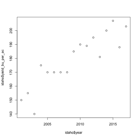
What to notice:
- There is a positive trend between the yield and years
- The x-axis label was inherited from the code passed into
plot() - The y-axis label was inherited from the code passed into
plot() - The range for x and y were automatically inferred from the data passed to
plot()
Axis labels and titles
The first thing to modify about a plot is the axis labels and title.
plot(idaho$year, idaho$yield_bu_per_ac,
     xlab='Year', ylab='Yield (bu/ac)',
     main='Idaho Corn Yields have Increased Since 2000')
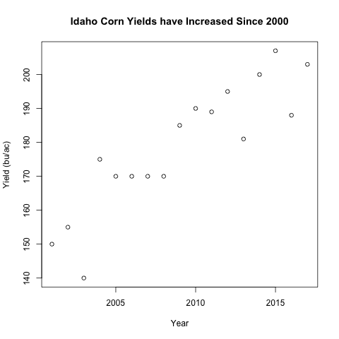
What to notice:
- The arguments:
xlab,ylab, andmaineach take a character value - It is best practice to have units on your axis labels
- Notice the title is larger than the axis labels by default
Overlaying data with points()
A common operation is to compare data across different sources on the same plot.
We will add the data from Illinois to our plot above using points()
is_illinois <- states == "ILLINOIS"
after_2000 <- years > 2000

illinois <- df[is_illinois & after_2000, ]

plot(idaho$year, idaho$yield_bu_per_ac,
     xlab='Year', ylab='Yield (bu/ac)',
     main='Idaho Corn Yields have Increased Since 2000',
     col="blue")
points(illinois$year, illinois$yield_bu_per_ac,
       col="red")
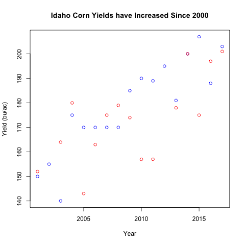
What to notice?
- The new argument
colassigns the same color to all points in the same function and the color can be specified using a character vector. points(), similar toplot()take in similar arguments (x, y coordinate for the points plotted)- Notice that some years are missing for Illinois relative to Idaho. This
could be missing data for yields or the data could be out of the range of
Idaho. Again, the range of the plot is determined by the
plot()function. Thepoints()function only adds points to the existing canvas.
Range of data
If you quickly check the range of the Illinois data, you’ll notice that its lowest value is much lower than the Idaho values. This suggests that the plot above is censoring some of the data because its range is limited by the Idaho data.
Turns out plot() allows you to tweak the range of the plot with arguments
xlim and ylim:
all_y_data <- c(idaho$yield_bu_per_ac, illinois$yield_bu_per_ac)
y_range <- range(all_y_data) # This is a vector of length 2

plot(idaho$year, idaho$yield_bu_per_ac,
     xlab='Year', ylab='Yield (bu/ac)',
     main='Idaho Corn Yields have Increased Since 2000',
     col="blue", ylim=y_range)
points(illinois$year, illinois$yield_bu_per_ac,
       col="red")
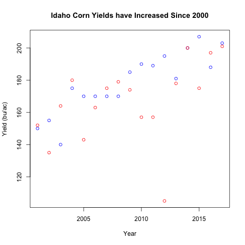
What to notice?
- We only used the
ylimargument because the years are the same ylimexpects a numeric vector of length 2, the first indicating the lower bound and the second indicating the upper bound.- Notice that we had to had to set the
ylimargument with theplot()function call. - Notice that a viewer seeing out graph have no idea which the different colors represent.
Starting with an empty plot
A common plot strategy is to start with an empty plot, then add points() from different sources.
x_range <- range(idaho$year)

plot(1, type="n",
     xlab='Year', ylab='Yield (bu/ac)',
     main='Idaho Corn Yields have Increased Since 2000',
     xlim=x_range, ylim=y_range)
points(idaho$year, idaho$yield_bu_per_ac,
       col="blue", pch=16)
points(illinois$year, illinois$yield_bu_per_ac,
       col="red", pch=15)
Notice that the function call to points() is slightly repetitive
which can be done with a for-loop later.
Breaking the calls this way makes plot() handle the shared
properties across data where points() will handle the
point locations, colors, and plotting characters for different
groups of the data. This division of responsibility for
different functions is a good way to think about structuring your code.
Legends
To label the different points, we will use a legend.
plot(1, type="n",
     xlab='Year', ylab='Yield (bu/ac)',
     main='ID/IL Corn Yields have Increased Since 2000',
     xlim=x_range, ylim=y_range)
points(idaho$year, idaho$yield_bu_per_ac,
       col="blue", pch=16)
points(illinois$year, illinois$yield_bu_per_ac,
       col="red", pch=15)
legend("bottomright", legend=c("Idaho", "Illinois"),
       col=c("blue", "red"), pch=1)
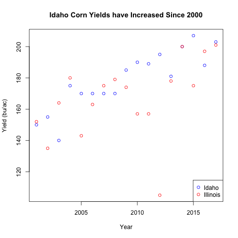
Here we introduced several arguments within the legend() function
- The first argument is the location of the legend, choices are
bottomright,topright,bottomleft, ortopleft. - The
legendargument is the text that should be displayed, this is often a character vector pchis the plotting character for the different legend values,0happens to correspond to a hollow point, this can be a vector so the different legends can take on different plotting characters.- The
colhere is the color for the different plotting characters. This is usually a character vector. - Notice that the order of
legend,pch, andcolneed to align. A single value will be “recycled” to match the other values passed to the function.
Changing the property for each point with vectors
Just like how each point can have its location specified using a vector, we can also use vectors to change each point’s color and plotting character.
For the example, we are switching away from real data for clarity
plot(1:20, 1:20, pch=1:20)
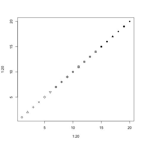
Notice how each point has a different plotting character starting from 1 to 20.
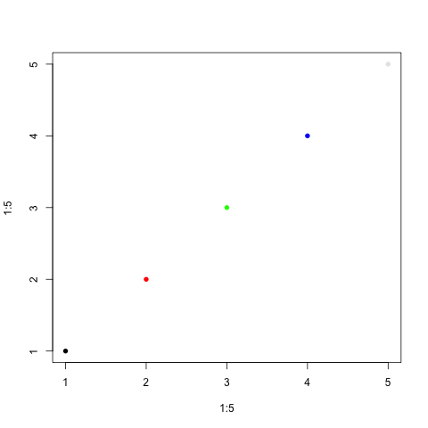
The same can be done with colors. Instead of using the usual character strings,
we’re going to use the rgb() function that specifies the amount of red, green,
vs blue coloring.
plot(1:5, 1:5, pch=16, col=c(rgb(0, 0, 0),
                             rgb(1, 0, 0),
                             rgb(0, 1, 0),
                             rgb(0, 0, 1),
                             rgb(0.9, 0.9, 0.9))
    )
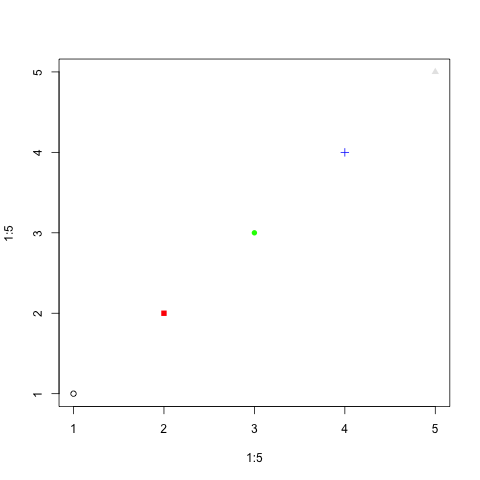
And you can change both at the same time:
plot(1:5, 1:5, pch=c(1, 15, 16, 3, 17),
     col=c(rgb(0, 0, 0), rgb(1, 0, 0),
           rgb(0, 1, 0), rgb(0, 0, 1),
           rgb(0.9, 0.9, 0.9))
    )
Plotting different states with different colors: for-loops
Imagining carrying out the example above for the different states in our original dataset for historical USDA corn yields. Our example above was slightly tedious to type out so we will use the for-loop to handle the different states.
df <- read.csv("usda_i_state_corn_yields_cleaned.csv")
states <- df$state_name
years <- df$year
uniq_states <- unique(states)
colors <- c("red", "blue", "black", "purple")

x_range <- range(years)
y_range <- range(df$yield_bu_per_ac)
plot(1, type="n",
     xlab='Year', ylab='Yield (bu/ac)',
     main='Corn Yields Increased across all i-States',
     xlim=x_range, ylim=y_range)
for(i in seq_along(uniq_states)){
    is_target_state <- states == uniq_states[i]
    # Subset only the records that correspond to the state of interest
    sub_df <- df[is_target_state, ]
    points(sub_df$year, sub_df$yield_bu_per_ac,
           col=colors[i], pch=16)
}
legend('bottomright', legend=uniq_states,
       col=colors, pch=16)
Factors
There’s another strategy that can plot quickly for different subgroups using a special data type called factors.
To give you an idea about the properties of factors:
char_demo <- c("red", "yellow", "yellow", "green", "red")
fac_demo <- as.factor(char_demo)
class(fac_demo)
# [1] "factor"

# Property 1, factors have levels
levels(fac_demo)
# [1] "green"  "red"    "yellow"

# Factors can be turned into numbers or characters
print(fac_demo)
print(as.numeric(fac_demo))
print(as.character(fac_demo))
Notice how the numbers from as.numeric correspond to the order of the
output from levels().
Levels are a unique attribute of factors!
A very special behavior in R is that if we try to subset with factors, it’s like subsetting with numeric values (in particular, the value corresponding to the different levels)!
levels(fac_demo)
# Notice the actions are intentionally chosen
# to be in order of the levels!
traffic_actions <- c('go', 'stop', 'yield')
print(traffic_actions[fac_demo])
print(fac_demo)
You can imagine that what happened in the subsetting above is that the factors were turned into numbers (according to the order of their level), then they were used to subset the vector.
What’s new is that, before, we have not subsetted the same value multiple times. Here, we will use this behavior to help us assign the different points different colors according to a factor.
Corn trajectories
Below we re-write the code from the for-loop above using factors.
df <- read.csv("usda_i_state_corn_yields_cleaned.csv")
states <- df$state_name
print(class(states))
colors <- c("red", "blue", "black", "purple")
plot(df$year, df$yield_bu_per_ac,
     pch=16,
     xlab='Year', ylab='Yield (bu/ac)',
     main='Corn Yields Increased across all i-States',
     col=colors[states])
legend('bottomright', legend=levels(states),
       col=colors, pch=16)
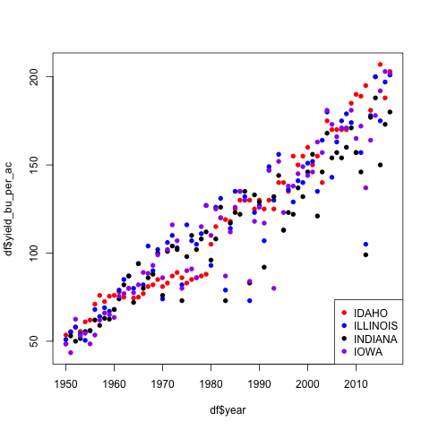
What to notice:
- Notice that all the data was used in
plot()so we did not need to specify the xlim or ylim values. - Notice that
colors[states]is a character vector with the same length asstates - The code is much shorter this way!
Saving plots with png()
If you want to save an image file using code, you can surround the
plotting code between a png("FILE_NAME.png") call and a dev.off() call.
Warning, the code below will create 3 “.png” files in your working directory!
colors <- c('red', 'blue', 'black')
for(i in seq_along(colors)){
    file_name <- paste0('test_plot_', colors[i], '.png')
    png(file_name)
    plot(1:4, 1:4, pch=1:4, col=colors[i])
    dev.off()
}
list.files()
You do not need to have a for-loop to save the for-loops but this is an example for you to create similar plots over different iterations.
Note that a common mistake is that people forget the dev.off() call.
Review
- Subsetting vectors with numeric, character, and boolean values
- New data type: booleans
- Operations with boolean values
- Vectorized operations with vectors
- Concept that the same function with different data types can behave differently
- New data type: data frame
- Reading in data from a .csv file
- New data type: factors
plot()